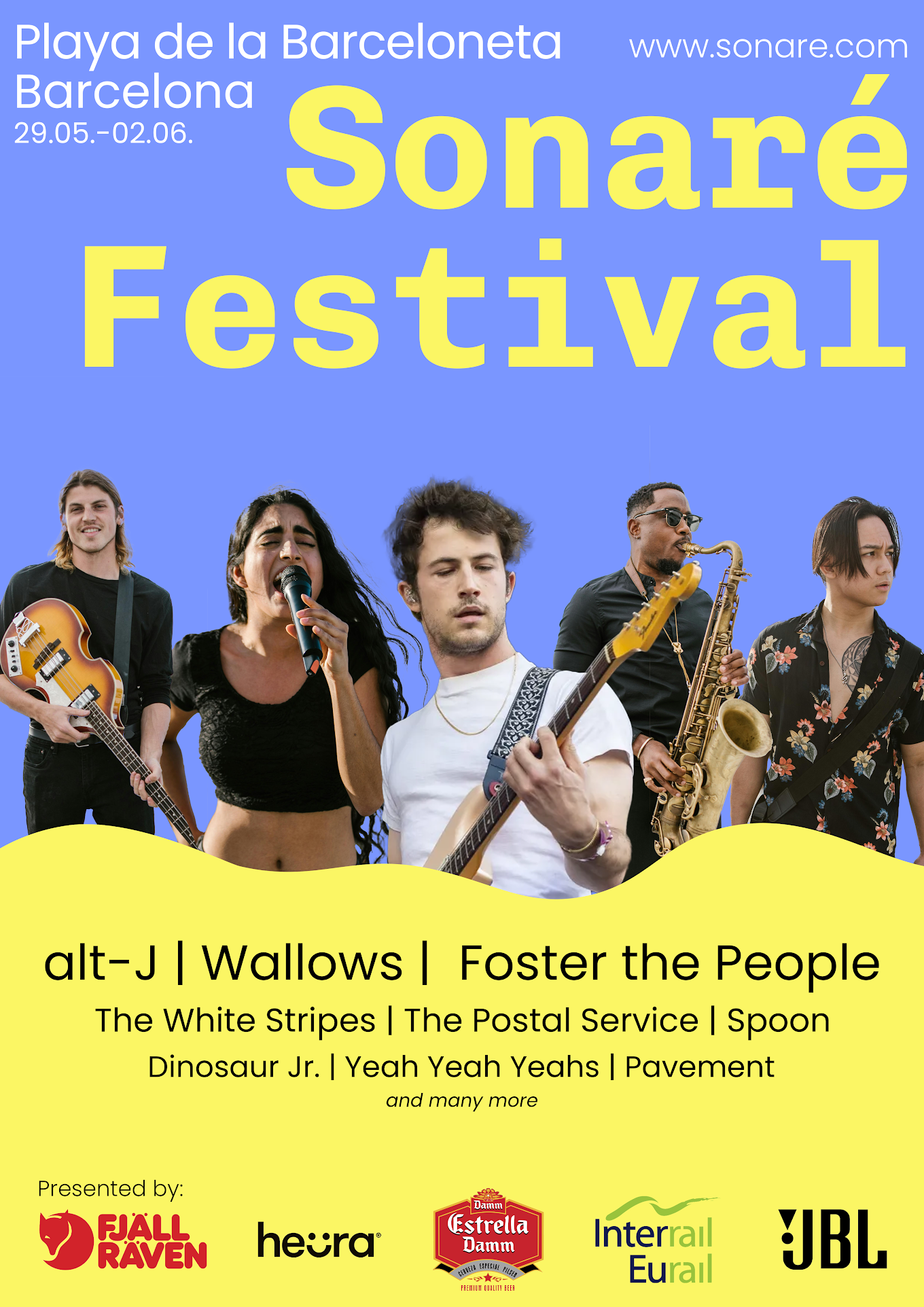
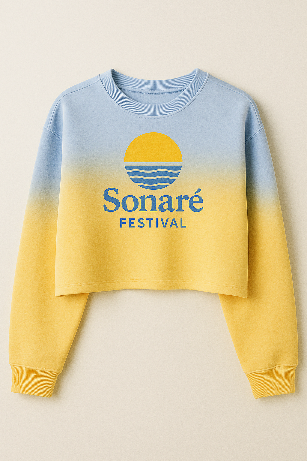
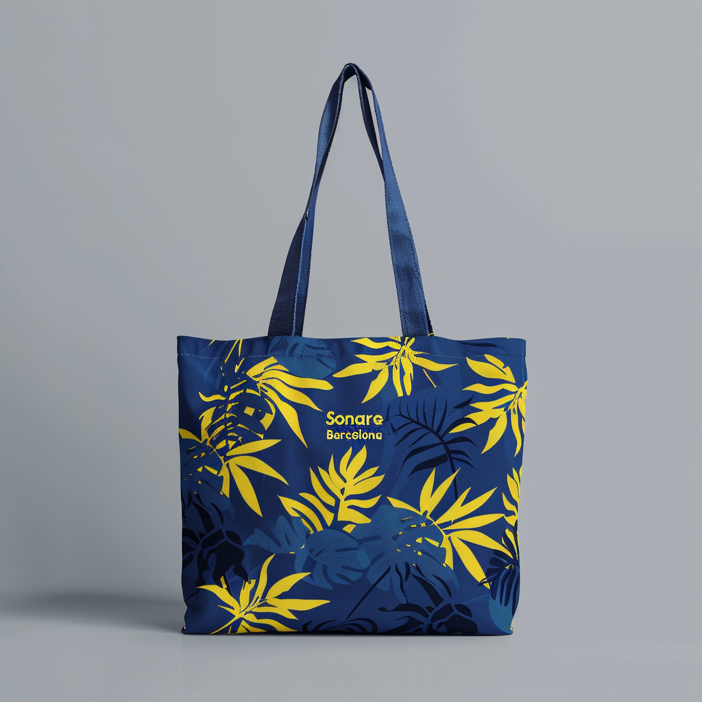
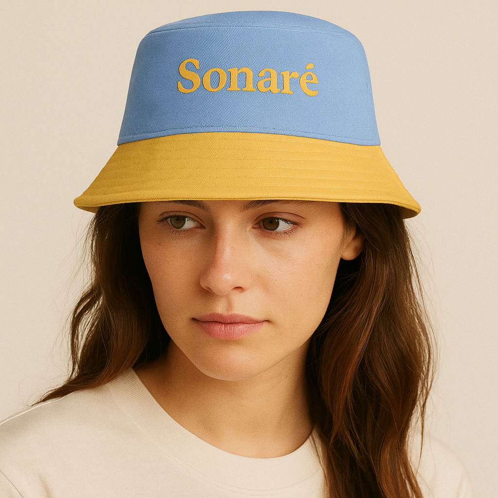
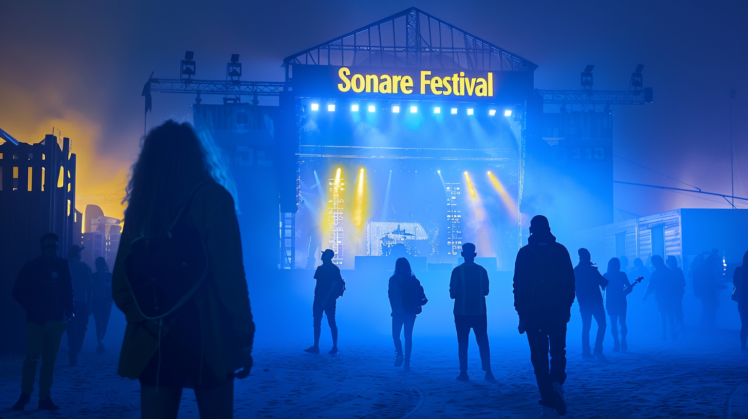
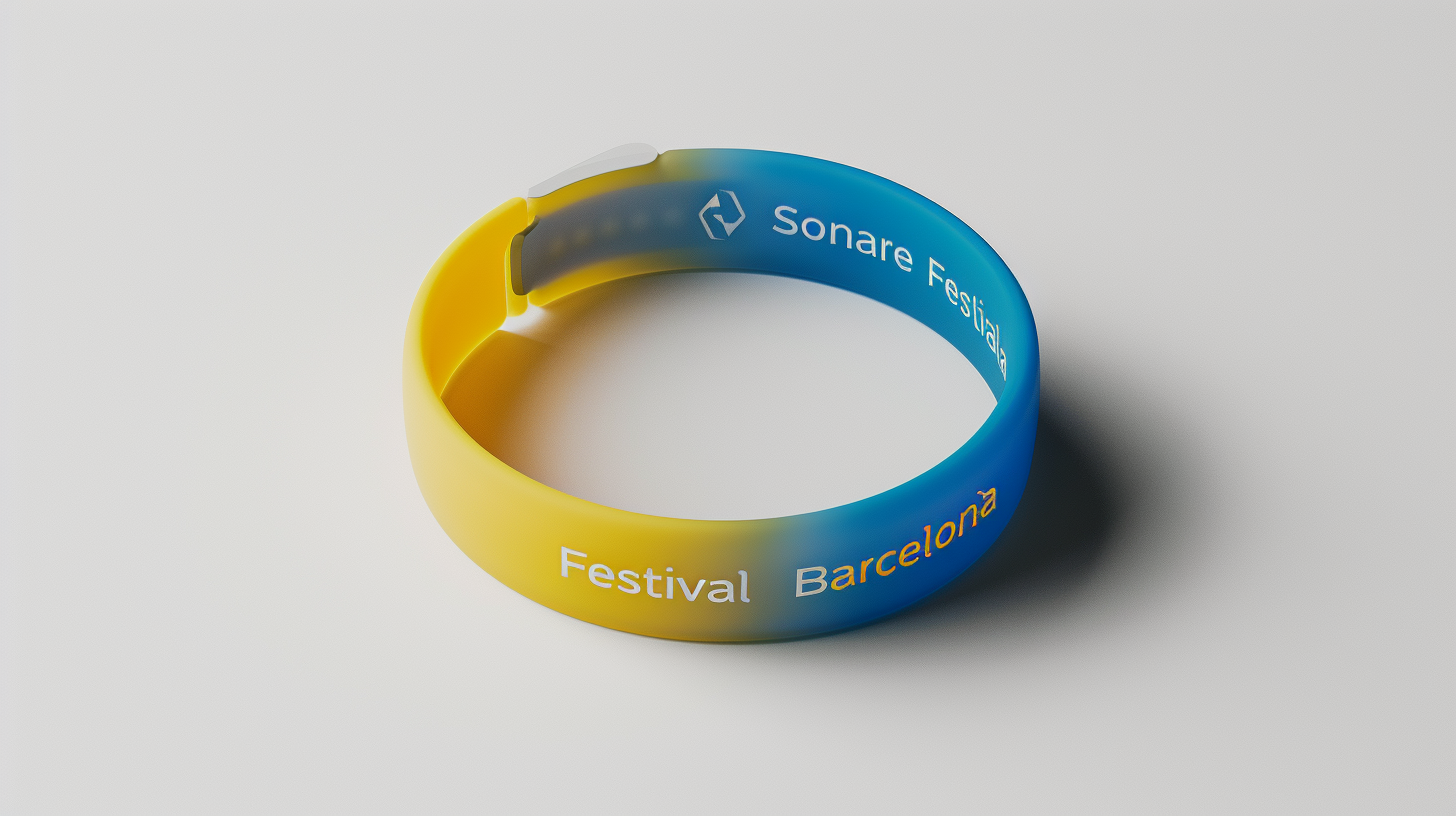
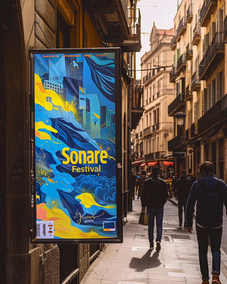
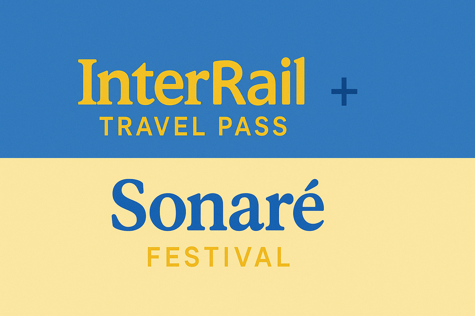
Bringing European Indie Culture to Barcelona's Coastline
A complete brand identity project that transforms Barcelona's beach into Europe's next indie music destination, combining strategic market research with compelling visual design.
Create a festival brand identity that captures Barcelona's indie music scene while appealing to young European travelers seeking authentic cultural experiences.
Design a compelling visual identity for a multi-day indie music festival that would position Barcelona as a destination for young, culturally-aware Europeans. The festival needed to feel authentic to local culture while being accessible to international visitors.
Analyze Barcelona's music scene and target demographic
Research Spanish linguistics and local cultural elements
Create visual identity reflecting beach, music, and youth culture
Identify authentic brand partnerships and sponsors
Deep cultural research informed every design decision, ensuring authenticity and market relevance.
Researched Barcelona's indie music landscape to understand the local scene and identify artists that would resonate with our target demographic.
Selected Playa de la Barceloneta for its central location, accessibility, and authentic Barcelona beach culture that isn't overly touristy.
Focused on 18-25 year olds: university students and recent graduates seeking cultural travel experiences across Europe.
Identified strategic partners that align with our audience's lifestyle and the festival's authentic Barcelona positioning.
Researched Spanish words that capture the festival's essence, leading to "Sonaré" - meaning "I will sound/dream" in Spanish.
Crafted the festival experience around the magic of beach culture: dancing, hanging out with friends, and watching sunrises together.
Creating a visual identity that captures the energy of indie music and the magic of Barcelona's coastline.
Mediterranean sky and ocean
#6B8CFF
Beach warmth and energy
#FFD93D
Selected Poppins for its modern, clean aesthetic that appeals to young audiences while maintaining excellent readability across digital and print applications. The geometric structure conveys the professional quality while the friendly curves suggest approachability and fun.
Extending the visual identity across multiple touchpoints to create a cohesive festival experience.
Instagram stories and posts maintaining brand consistency while optimized for mobile engagement and shareability across European markets.
Complete app interface featuring schedules, artist information, interactive maps, and social features using the established visual system.
High-quality festival apparel featuring the signature design on premium cotton, available in multiple colorways.
Cozy streetwear pieces with embroidered branding and Barcelona coordinates for year-round festival memories.
Eco-friendly canvas bags perfect for festival essentials and daily use, reinforcing environmental consciousness.
Complete accessory line including bucket hats, sunglasses, and tech accessories maintaining brand consistency.
Immersive stage design incorporating brand colors and typography, creating an Instagram-worthy backdrop for performances.
Premium silicone wristbands in brand colors that serve as both access control and lasting festival keepsakes.
Comprehensive signage system helping attendees navigate the beach venue while maintaining visual brand consistency.
Co-branded materials with Barcelona's iconic beer brand, maintaining authentic local connections while expanding reach.
Strategic alliance promoting sustainable travel to Barcelona, targeting young Europeans with train travel packages.
A scalable visual identity that works across all touchpoints while maintaining consistency and flexibility.
A comprehensive logo family designed for maximum versatility across digital, print, and merchandise applications.
Complete lockup with festival name and location. Used for main branding, posters, and website headers.
Side-by-side arrangement perfect for headers, banners, and co-branding scenarios with partners.
Abstract symbol incorporating Barcelona elements. Perfect for social media profiles and app icons.
Stylized "S" for minimal applications, embroidery, and when space is extremely limited.
Typography-only version optimized for merchandise production and simple applications.
Square format designed specifically for mobile applications and digital platforms.
A carefully curated palette reflecting Barcelona's Mediterranean vibes and festival energy.
#6B8CFF
Mediterranean sky and ocean depth
#FFD93D
Beach warmth and festival energy
Deep Black
#1A1A1A
Pure White
#F9F9F9
Neutral Gray
#B8B8B8
The signature blue-to-yellow gradient captures the essence of Barcelona's golden sunsets over the Mediterranean, used across all primary brand applications.
Poppins provides the perfect balance of modern aesthetics and excellent readability across all applications.
Genuine connection to Barcelona's music culture and beach lifestyle
Energetic and alive, capturing the excitement of festival experiences
Relaxed beach vibes with sophisticated European sensibilities
Welcoming to young travelers from across Europe and beyond
This project demonstrates strategic thinking beyond visual design, showcasing cultural research, market analysis, and systematic brand development.